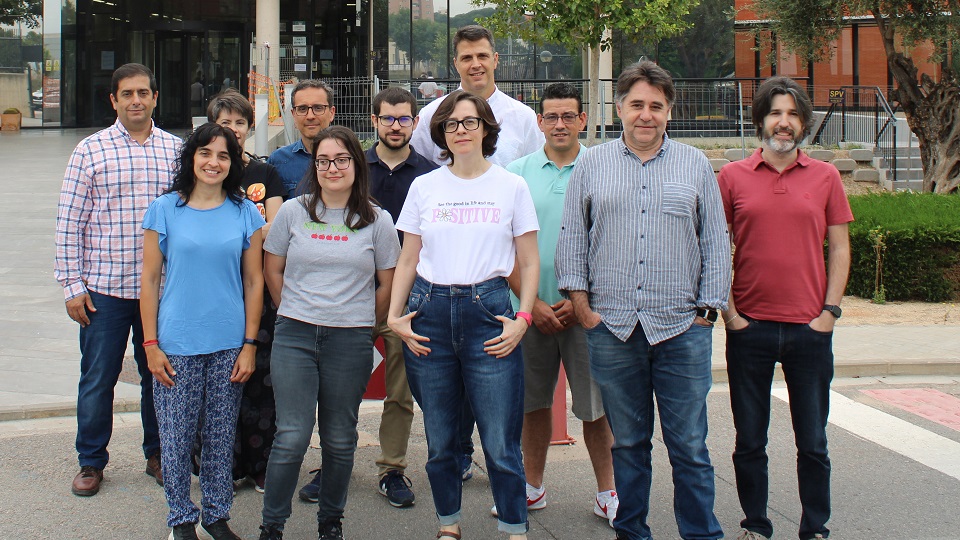
The new IRTIC project, located in the University of Valencia Science Park (PCUV), in collaboration with the Department of Art History of the UV, seeks advanced visualization of historical data through multidimensional maps and interactive graphics, and thus increase their visibility and explore their characteristics
The Institute of Robotics and Information and Communication Technologies (IRTIC), located at the University of Valencia Science Park (PCUV) and the UV Department of Art History are coordinating the project "ClioViz: Advanced visualization of historical data through multidimensional maps and interactive graphics". The initiative will generate a multidimensional map in which users will be able to interactively explore the existing information on heritage objects and select the search parameters they want, as well as interact with the graphics that represent the pieces.
In this way, the action will contribute to the accessibility of cultural heritage by using digital media in an innovative way for research and dissemination. Geocoding will make it possible to locate, as far as possible, the catalogued objects by means of geographic coordinates based on their place of origin; data processing will make it possible to homogenize, extract and quantify relevant information, as well as to explore possible ways of visualizing historical information that is often heterogeneous or ambiguous. It will also take advantage of the knowledge generated to improve the online visibility of Spanish heritage.
ClioViz uses as its source the CERES database, the online catalog that compiles a selection of cultural assets from the collections of the Digital Network of Museum Collections of Spain, thanks to the collaboration of the Subdirectorate General of State Museums, belonging to the Ministry of Culture and Sport. This will make it possible to generate a series of multidimensional graphs and maps that will group the different aspects of a concept to present its details easily, by adding the desired filters: for example, temporal or thematic.The initiative, therefore, also aims to refine existing filters, detect possible gaps and open up the field with respect to how works of art and historical objects are studied. This responds to the growing interest in scientifically representing this type of data, and is an example of the application of data science to the humanities.
The initiative will generate a multidimensional map in which users will be able to interactively explore the existing information on heritage objects and select the search parameters they want, as well as interact with the graphics that represent the pieces
New ways of visualizing art
According to Jorge Sebastián, project researcher in the Department of Art History, "museums are experimenting with different ways of visualizing their collections through digital media, for example, using quantitative methods, something traditionally little explored in the humanities. Cultural heritage researchers can also benefit from techniques that are very common in data science, to pose new hypotheses or test research questions from large data sets, such as those offered by CERES".
In this regard, in studying how to visually represent spatiotemporal graphs, the ClioViz team explored how students in the fields of data science and art history perceived them. "In digital humanities it is not usual to visualize our uncertainty about the place of origin of some heritage objects, since the custom is to access other types of systems such as a card with textual information about the item," says IRTIC lead researcher Cristina Portalés. However, she adds, "this representation aims to quantify and indicate whether there are ambiguities in the information available, which is unusual in this field".
"In digital humanities it is not usual to visualize our uncertainty about the place of origin of some heritage objects, since the custom is to access other types of systems such as a card with textual information of the element," Cristina Portalés, principal investigator on behalf of IRTIC
Thanks to student feedback, the gallery of graphs to be used was expanded to better explain uncertainty in geolocation data. Examples included changing the axis because students were not used to visualizing a bar chart with the categorical variable on the ordinate axis; using size as an aesthetic to visualize the number or percentage of objects; or changing the grouping variable that could organize the graph and make quicker comparisons between groups.
During and after the process, students stated that the use of scientific visualizations could bring added value to the field of cultural heritage. Some highlighted that scientific visualizations could provide a better understanding of concepts and help to draw new conclusions, analyze available information and make decisions, or that they capture relevant data in a more visual and understandable way.
The initiative, funded by the Ministry of Science and Innovation through the Call 2021 - "Knowledge Generation Projects", started in September 2022 and will run until the end of August 2025.


